Posts

Showing posts from March, 2018

Last on Editable Templates

Image
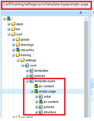
When we first create an editable template (out of OOB template type or custom project specific template types), it will be in Draft version. Once when we are done with editing our "Editable template" using template editor, we need to enable and allow it before making use of it to create pages. Enable Editable Template: Navigate to Tools -> General -> Templates -> sitespecificfolder -> Editable template will be in " Draft " version as indicated by swatch being in "yellow" Click on the template -> More actions icon -> select Enable -> Editable template is enabled as indicated by swatch turned to "green" Allowing Editable Template: Navigate to site root page -> Page properties -> Advanced tab -> add " /conf/training/settings/wcm/templates/.* " in " Allowed Templates " section With this steps completed, we are good to create pages using Enabled editable templat

Policies in Editable templates

Image
In this post, we will cover about policies in Editable templates. With project specific editable templates folder structure (created via configuration browser), we are done with " template-types" and "templates" (highlighted in green) and in this, project specific policies will be stored under  "policies" in the path - /conf/training/settings/wcm/policies Policies: Policies in Editable templates are similar to Design properties in static template Policies can be defined at component level (properties or option that we see on "Policy" assign console is nothing but the properties/fields that we have as part of Design dialog of that particular component) Layout container or parsys or specific components like title, image or any specific component for that matter, if it has design dialog (with some desired fields), the same would be rendered in "Policy" console Policies can be defined for "base page component" (u

Creation of Editable Templates

Image
In this post, we will create Editable template using the custom template type created for specific project. Out of the structure generated out of project specific template folder creation via Configuration browser (highlighted below under /conf/training/settings/wcm ), we are done with template-types(highlighted in green). Now, the editable templates that we will create out of empty-page template type will fall under the path(highlighted in red) -   /conf/training/settings/wcm/templates Steps for Editable template creation: Navigate to Tools -> General -> Templates -> projectspecificfolder (this folder would have been created automatically when we create project specific templates folder via configuration browser. In this case, it is training folder) Inside projectspecificfolder , click on " Create " -> projecspecifictemplatetype (in this case, empty-page ) After choosing the template-type -> click on Create -> provide suitable title and optio

Creation of Template Types for Editable templates

Image
In this post, we will create templates types which is the base for creating editable templates. Before getting to the subject directly, have added an introduction about templates in general. Template is the base for creating pages. Starting AEM 6.2, we have categorisation for templates - Static and Editable templates. Static templates :  This has been available for several versions of AEM/CQ Created using "Create Template" option with base page component as resourceType (which is responsible for rendering the page structure).  Template ( base page component as resourceType ) -> Page This cannot be edited as such. Since it just holds a reference to base page component, any changes to the page (other than authorable components), would need a change in base page component which is ultimately a work of developer. (calls for a code change) Allowed components are configured using Design mode (list being saved to etc/designs/projectfolder/templatename/jcr:content)

Custom Validation for Coral UI 3 Multifield using foundation-validation

Image
In this post, we will write a custom validation for Coral UI3 Multifield resource and for the fields used as part of multifield using foundation-validation and making use of granite:data (common attributes) Multifield Resource Type : granite/ui/components/coral/foundation/form/multifield Constraint : Limit the number of multifield items that can be authored Validation name : multi-validate Steps for adding validation: Create a folder named  "dialogfieldvalidations" within your project(like one stop place for all custom validations) -> create clientlibs folder of type cq:clientLibraryFolder under the folder created.(categories : cq.authoring.dialog/any other name with inclusion of the same via embeds or per your project clientlib structure) Create script.js file and add code related to all custom validations with js.txt file for including the script.js file Usage: Create a property named " validation " with the value registered with foundatio

granite:commonAttrs - Implemenation difference b/w Coral UI 2 and Coral UI 3

Image
Out of the 3 differences between Granite Components based on Coral UI 2 and Coral UI 3, we are done with Validation change. In this post, we will get insights of the implementation change in common attributes (granite:commonAttrs) Common Attributes: Concept of common attributes is similar to HTML global attributes. (global attributes are those that are common to all HTML elements). For Granite UI based components, list of common attributes are highlighted  here. Change done on Coral UI3 : Common attributes(say granite:class ) are strictly implemented to replace existing properties (say class ) We will consider a Touch UI dialog which uses CoralUI2 and Coral UI3 textfield and understand the difference in terms of implementation and usage. Out of the attributes listed in above link, most commonly used are class, id, title and data related attributes . Hence the same is considered for illustration. Granite Coral UI2 Textfield : Resource Path:  /libs/granite/ui/components/foun

RTE mandatory/blank space content validation using foundation-validation

Image
One of the differences between CoralUI 2 and Coral UI 3, change in the way we do validation is illustrated in this post with an example. Till AEM 6.2, we would have used $.validator.register (jQuery Plugin) for validating dialog fields. The same is deprecated in AEM 6.3 and it is recommended to use foundation-validation. Example : Validation/constraint validating if RTE content is null/empty along with validating blank space. (clicking on enter to produce blank space rather than actual content in editor area) Before getting into an example, we will have an understanding on foundation-registry, foundation-submittable, foundation-validation, foundation.validation.selector, foundation.validation.validator. foundation-registry: It is a general purpose registry to register anything required by components. (anything refers to registering a validator/ registering a custom selector - in this case.) It is similar to OSGI declarative service. (where we register a Java compon

Difference b/w Granite UI Components based on Coral UI 2 and Coral UI 3

Given the fact that we have two sets of Granite UI components based on Coral UI2 and Coral UI3, below are the differences mentioned per Adobe documentation. Coral UI2 Components Path /libs/granite/ui/components/foundation/* Coral UI3 Components Path /libs/granite/ui/components/coral/foundation/* Coral UI2 Clientlibs granite.ui.foundation, granite.ui.foundation.admin, coralui2 Coral UI3 Clientlibs granite.ui.coral.foundation, coralui3 Coral UI 3 based components will not have layout concept . Replacement/alternative being  direct standard component for simplicity. While creating touch UI dialog, we create a node named "layout" with resourceType being the layouts from the path " granite/ui/components/foundation/layouts/* " Eg: Coral UI 2: if layout resourceType used is granite/ui/components/foundation/layouts/tabs , equivalent Coral UI 3, granite/ui/components/coral/foundation/tabs . section component( granite/ui/components/foundation/secti

Touch UI Concepts - Granite UI, Coral UI

Image
Touch enabled UI being the standard UI for AEM, is based on Coral UI and Granite UI. (not an open source project.) Coral UI : We can classify this further as Javascript components offering functionality and  CSS-only components Granite UI: Components built with Coral UI to provide UI widgets. Example of Coral UI as Javascript component: Components/functionalities like accordion/tabs which we usually/previously would have done using HTML markup with some jQuery plugins to bring out the final outcome as accordion/tabs.  In Coral UI, the same is exposed to us via tags named  <coral-accordion>, <coral-accordion -item> and other related tags for a particular feature. Example of Coral UI as CSS-only component: Dialog fields which are in the form of HTML input tag (say pathbrowser/pathfield), has classes named coral-InputGroup, coral-InputGroup-input (targeting input tag), coral-InputGroup-button (targeting the button with icon -> click of which lets us sele

Touch UI Dialog - Collapsible Layout

Image
With the understanding of basic structure of Touch UI dialog, it is evident that with layouts and proper use of container we can bring out the dialog look and feel we desire. In this post, l have tried collapsible layout. On Click of the text, it is as per the screenshot below. Dialog structure to be created to bring out the above look and feel : Must follow about collapsible: layout node with resourceType - granite/ui/components/foundation/layouts/collapsible has to be created under the content node(highlighted in red above)with  resourceType - granite/ui/components/foundation/container    jcr:title to be added to this content node(container) - . In this case, jcr:title -> Click here to fill dialog inputs Note:  content node(in red) immediately holding the layout should not be of resourceType - granite/ui/components/coral/foundation/container .  If we do, dialog fields will be displayed as if it is included without a layout. Reasons for introdu