Touch UI Dialog - Collapsible Layout
With the understanding of basic structure of Touch UI dialog, it is evident that with layouts and proper use of container we can bring out the dialog look and feel we desire. In this post, l have tried collapsible layout.

On Click of the text, it is as per the screenshot below.

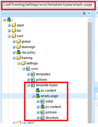
Dialog structure to be created to bring out the above look and feel :

On Click of the text, it is as per the screenshot below.

Dialog structure to be created to bring out the above look and feel :
Must follow about collapsible:
- layout node with resourceType - granite/ui/components/foundation/layouts/collapsible has to be created under the content node(highlighted in red above)with
- resourceType - granite/ui/components/foundation/container
- jcr:title to be added to this content node(container) - .
- In this case, jcr:title -> Click here to fill dialog inputs
- Note: content node(in red) immediately holding the layout should not be of resourceType -granite/ui/components/coral/foundation/container. If we do, dialog fields will be displayed as if it is included without a layout.
Reasons for introducing coral/foundation/container before adding collapsible:
- margin property can be introduced only via coral/foundation/container -> space between dialog header and collapsible layout.
- Also, this coral container will hold the complete contents under it as a whole with surrounding div. (per the container behaviour discussed in base dialog structure)
- Note: container can be of type(../component/foundation/container) as well in which case we can prevent the collapsible from covering the entire dialog content, but will be in touch with the dialog header without space/margin properties.
Below is the screenshot (A) if we use the collapsible layout directly (Look and feel + dialog structure)
Screenshot A:
Dialog structure for the above.
Other screens:
Below is the case if we are not adding jcr:title property to the container node immediately holding the collapsible layout
Conclusion:
Based on the look and feel desired, we can use container accordingly which will group/include resources considering the layout type.
Reference: Adobe helpx links on Granite UI.


Exploring Real Estate Gurgaon, I was impressed by Trehan Luxury Floors in Sohna Sector-35. The project offers spacious 3BHK independent floors with modern interiors, premium finishes, and thoughtfully designed layouts. Every home is crafted for comfort, privacy, and a luxurious lifestyle.
ReplyDeleteTrehan Luxury Floors is setting a new benchmark in real estate Gurugram with its luxurious and thoughtfully designed residential projects. Each home reflects superior craftsmanship, modern architecture, and the perfect blend of comfort and style. Located in prime areas, these properties offer seamless connectivity, premium amenities, and excellent investment potential. Whether you’re searching for your dream home or a high-value asset, delivers
ReplyDeleteTrehan Luxury Floors is setting a new standard in real estate Gurgaon with its luxurious residential developments that combine modern architecture, premium quality, and unmatched comfort. Each home is crafted with attention to detail, offering spacious designs and top-tier amenities for a refined living experience. Situated in prime locations, these properties provide excellent connectivity, a vibrant neighborhood, and great investment potential. For those seeking sophistication and long-term value, stands as a trusted name in Gurgaon’s dynamic real estate market.
ReplyDeleteTrehan Luxury Floors is redefining real estate Gurgaon with its exceptional blend of luxury, design, and functionality. Each project reflects superior craftsmanship, modern architecture, and attention to detail, offering residents a premium lifestyle in the heart of the city. With prime locations, world-class amenities, and strong investment potential, has become a trusted name for homebuyers seeking elegance and comfort. Whether for living or investment, these properties stand out as a symbol of excellence in Gurgaon’s rapidly growing real estate market.
ReplyDeleteTrehan Luxury Floors is setting new standards in real estate Gurgaon with premium homes featuring modern design, excellent connectivity, and strong investment value, making it a preferred choice for buyers seeking luxury and reliability.
ReplyDeleteDiscover premium living with 3BHK Sohna Road residences crafted by Trehan Luxury Floors, offering modern luxury and unmatched comfort in real estate Gurgaon.
ReplyDelete