Configuring responsivegrid/Layout Container component
Responsive Layout/design in AEM web pages is achieved with the help of responsivegrid or Layout Container component. This provides a paragraph system which lets us to add components and position them within the responsive grid.
/* maximum amount of grid cells to be provided */
@max_col: 12;
/* default breakpoint */
.aem-Grid {
.generate-grid(default, @max_col);
}
/* phone breakpoint */
@media (max-width: 768px) {
.aem-Grid {
.generate-grid(phone, @max_col);
}
}
/* tablet breakpoint */
@media (min-width: 769px) and (max-width: 1200px) {
.aem-Grid {
.generate-grid(tablet, @max_col);
}
}
Layout Container or responsivegrid component:
ResourceType : /libs/wcm/foundation/components/responsivegrid
To make use of this in our site, below needs to be done:
- Include the Layout container component in base page component or can be dragged and dropped from component browser.
- Include the responsive CSS
- Enable Emulator
- Enable Layout mode.
Including the component:
- Include the responsivegrid component via data-sly-resource or cq:include in HTL or JSP respectively in base page component using which templates would be created and hence the pages.
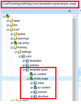
- In case of editable templates, we can explicitly define responsivegrid component under structure node of template-types.
- It can also allowed to be included from component browser via drag and drop.
Include the responsive CSS:
- Base grid definition is available at /etc/clientlibs/wcm/foundation/grid/grid_base.less
- In our project specific clientibs, create ".less" file say, style.less and import the above base grid file and specify grid cells/columns required and grid definitions specific to device.
- Sample definition as available in Adobe helpx link
/* maximum amount of grid cells to be provided */
@max_col: 12;
/* default breakpoint */
.aem-Grid {
.generate-grid(default, @max_col);
}
/* phone breakpoint */
@media (max-width: 768px) {
.aem-Grid {
.generate-grid(phone, @max_col);
}
}
/* tablet breakpoint */
@media (min-width: 769px) and (max-width: 1200px) {
.aem-Grid {
.generate-grid(tablet, @max_col);
}
}
Enable Emulator:
- Create sling:osgiConfig node under project specific config folder (/apps/training/confg) in the name - com.day.cq.wcm.mobile.core.impl.MobileEmulatorProvider-xxx (xxx - identifier to be provided specific to project as it is a factory service) and property named mobile.resourceTypes with value being our project's base page components (using which templates and hence pages would be created.)
- Eg: mobile.resourceTypes (String[]) - training/components/structure/page
- Add property named "cq:deviceGroups" with value being /etc/mobile/groups/responsive in jcr:content of site's root page.
- Eg: /content/training/jcr:content - cq:deviceGroups (String []) - /etc/mobile/groups/responsive
Enable Layout mode:
- Layout mode will be available in the toolbar as one of the modes along with Edit/Design mode only if we specify Breakpoints.
- Breakpoints are defined either at template level or at jcr:content of root page of the site so that all the pages created under that will have the mode available.
To be added under /content/training/jcr:content
cq:responsive (nt:unstructured)
breakpoints (nt:unstructured)
phone (nt:unstructured) title and width as properties on this node
tablet (nt:unstructured) title and width as properties on this node
With this four steps above, we will have responsivegrid component ready to use with Layout mode(position component within the grid)and with Emulator (for viewing how content will be rendered in configured devices)
Reference: Adobe helpx links
Reference: Adobe helpx links


Comments
Post a Comment